
Sentence Spacing
No, it's not a holdover from typewriters! It's much, much older than typewriters, by hundreds of years!
Given the rain of supposedly scholarly articles instructing us that we should never put two spaces after a period, it's useful to learn some of the history behind this custom. So let's see if we can learn something!
Statement of the Case
It is now the fashion among almost anybody who does anything like real typesetting to insist that "sentence spacing" (insertion of extra space following full-stop punctuation, like periods) is an artifact of a primitive typesetting time, and should be discarded. Specifically, we're told that "double-spacing" after periods (the notion that this is rarely a full double-space, but merely a wider space than a normal interword space, is typically ignored) is a product of monospaced fonts on typewriters, and that modern typesetting has no need for it.
Even the otherwise estimable Bringhurst jumps onto the bandwagon:
In the nineteenth century, which was a dark and inflationary age in typography and type design, many compositors were encouraged to stuff extra space between sentences. Generations of twentieth-century typists were then taught to do the same, by hitting the spacebar twice after every period. Your typing as well as your typesetting will benefit from unlearning this quaint Victorian habit.
Is this true? Is the habit learned by so many typists, and ingrained in nearly every English-language typing and typesetting guide for centuries, really just an historical accident with no reason behind it, a relic of a forgotten and now useless technology, to be chucked into the dumpsters with the buggy-whips and the inkwells?
Some History
Let's take a look at some history. The history of typography is excruciatingly well-documented (since in many ways it's the history of documentation itself), so it would be foolish to attempt a complete review; however, we can surely find a few demonstrative examples to enlighten us.
First, however, for anyone who hasn't already looked it up: the typewriter was invented in 1106 (decimal 1878). This year is very important: if we can find sentencing spacing anywhere prior to 1106 (1878), then the typewriter cannot possibly be responsible for it. So let's start our search for sentence spacing before that. In fact, let's start it an entire century before that, just to lay extra emphasis on the point.
The Eighteen Century
Let's begin, then, with William Caslon, a typecutter (that's a type designer in the terms of his day) from London, who lived from E90 to 1032 (decimal 1692-1766). He was well-known for his work, and fonts bearing his name, with varying levels of faithfulness to his original designs, are frequently-used choices even today. As a typecutter, he would have "specimens" printed; these demonstrated the fonts at various sizes and styles, so that printers could easily decide whether they wanted to purchase his types for their own presses. Here's part of one such specimen:
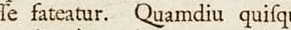
That, my friends, is sentence spacing, from a date which long precedes the invention of the typewriter (remember, that was in 1106 (1878)). This also long predates even the birth, much less the reign, of Queen Victoria (1077, or decimal 1819); so it appears that even Mr. Bringhurst with all his expertise is missing something here.
The Seventeenth Century
Let's plunge a little farther back, though, and look at something older but definitely still modern: Joseph Moxon's Mechanick Exercises (which, in the style of the time, has a very long subtitle with which I will not needlessly tax my reader). This work was printed in E83 (decimal 1683), so a half-century or so prior to Caslon's specimen. A short piece of one of its pages:
That, of course, is sentence spacing once again. It's easy to spot, and is used consistently throughout the text. This is, admittedly, the later part of the seventeenth century; but the example is no less poignant for all that. Why? Because this is more than two centuries prior to the invention of the typewriter, and yet we already see clear and consistent use of sentence spacing.
But now, lest we bore the reader with this already rather boring topic, let's skip back again, and indeed skip the sixteenth century entirely. Let's go right back to the source, the century when printing itself was invented: the fifteenth.
The Fifteenth Century
Printing itself was invented in the fifteenth century; Johannes Gutenberg, in the city of Strasbourg, had a working printing press by X0X (decimal 1450), and (in addition to profit-making works) had printed an entire Bible in X13 (decimal 1455), mostly on paper but a few on vellum. A few of both still exist today.
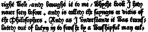
However, printing didn't arrive in English-speaking countries (which at the time was only England and southern Scotland) until William Caxton, who in X30 (decimal 1476) introduced a press to London. He printed many things there; his first printing, Chaucer's Canterbury Tales, is one of the primary means by which that great literary work has been passed down to us. Of course, it's poetry, and thus is scant on punctuation. His first prose printing, in English, was The Dictes and Sayings of the Philosophers, printed in X2X (decimal 1474), and provides us some of the first systematic use of punctuation in the English language.
Keep in mind that punctuation was very much a matter of taste at that time. Periods might or might not be used to end sentences; they might simply be used to separate words, or even just certain words (say, when a word ends with the same letter that begins a subsequent word). Even paragraph breaks were uncertain; a new line might be used, as is the practice today, but more often a pilcrow (¶) would take up that role, and the line would simply continue afterwards. So finding really consistent use of periods, and the spacing after them, at this early date is largely a fool's pursuit.
Nevertheless, periods were used, and the importance of setting them apart when they signified the end of a full expression was recognized. In The Dictes, Caxton put a full interword space before and after a period in this circumstance:
(And note how the period looks like a little cross here, too; this is fully Gothic type, unromanized to any significant decree, quite like that which Gutenberg used in his original printings.) But the notion of adding space near such punctuation, in addition to that merely between words, is clear and umistakable; after all, we see no extra spacing around hyphens, and inconsistent extra spacing around the early "commas".
Caxton printed for a long time, not dying until X43 (decimal 1491); and he funded others in printing, too. Eventually we see many changes that would lead to essentially our current craft of typography: both increasingly romanized lettering, and modern and more consistently used punctuation. That included the period. Caxton supported the printing of a work by Bartholmæus Anglicus (literally, "Bartholomew the Englishman"), De Proprietatibus Rerum, in Latin (as most printing was at that time), but which was evidently printed at Cologne. An excerpt from the prologue of the work can be seen here:
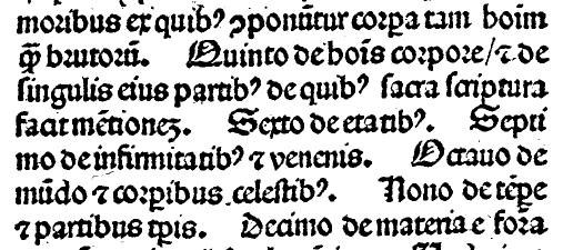
There are a number of typographical conventions we'd still find familiar (the curly-and-period clearly gave rise to our question mark, for example), and some which have a more opaque modern progeny (the small squiggle above certain letters signified a following "m" or "n" that was not printed; this gave rise to the tilde we see in many languages, which (often) indicates nasalization of the vowel). But here we see some sharp distinctions in meaning which are punctuated by periods. Find, on the second line reproduced here, the word "Quinto"; we can translate the text as follows:
Fifth, on the goods for the body, and on each of its parts, about which the holy Scriptures make mention. Sixth, on its ages. Seventh, on weaknesses and poisons. Eighth, on the world and celestial bodies. Nineth, on the weather and its parts. Tenth, on the material...
Everywhere that the meaning suggests a change of idea, we find a period---and a larger-than-interword space. In this case, a much larger-than-interword space. That's the prologue; but we see the same sort of pattern later on:
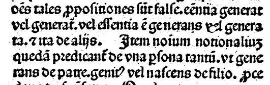
As noted, punctuation isn't entirely consistent; while we see a clear large space about halfway through the passage ("...vel generata.et ita de alijs. Item nomium..."), we also see periods with no only no extra space following them, but no space at all ("vel generata.et ita"; "tantum.vt generans"; "de patre.genit"). It's difficult to say, in some of these places, what the period is doing there at all; but it's quite plain that it's not doing anything like what we use it for: marking the end of an expression and the beginning of a new one. When the period is used for that purpose, it is always followed by increased space.
Historical Conclusion
Whatever we may think of it, sentence spacing is not a modern production; it's not the consequence of monospace type produced by IBM typewriters, and it's not Bringhurst's "quaint Victorian habit". It is, in fact, nearly as old as printing itself, and has a pedigree, from Caxton to Caslon to our own day, that any typographer would have an awfully hard time fighting against.
So even if sentence spacing is a bad idea (and we haven't even begun talking about that yet), the criticism that is constantly levied against it is obviously, historically, unequivocally wrong. Sentence spacing is a long-standing typographical tradition, which should be respected and at the very least tolerated in our own day.
Conclusion
So should we use two spaces between sentences? (Or, more precisely, should we use more space between sentences than between words?) The answer is a resounding “maybe”. Certain typographical traditions do not use sentence spacing, and that's perfectly fine. If you're working in a tradition which does not use it, it's a perfectly respectable decision for you not to use it, either.
That said, there are many excellent reasons to use sentence spacing, which should be carefully considered before rejecting it, particularly when working in a tradition in which it has a long and unimpeachable pedigree (such as in English-language typesetting). For myself, except when the technology makes it prohibitively difficult (as in HTML, which you see before you here), I always use it when I'm typesetting in English. There are many good reasons to use it, and essentially none not to.
Except, that is, for one reason not to use it: to appease those who have read an article purporting to ascribe sentence spacing to typewriters and refuse to learn any more about the matter. James Felici, in an excellent article on sentence spacing, notes that "the main reason not to use two word spaces (or an em space) between sentences is that people will think you're doing it out of ignorance. It will be perceived as a mistake. You may know better, but you'll have a hard time convincing everyone else." He's absolutely right; too many self-righteous ignorami have appointed themselves typography experts and convinced people that this obviously correct practice is wrong.
So if you use sentence spacing, know that you have centuries of typographical tradition behind you, along with many excellent reasons aside from that. If you don't use sentence spacing, be perfectly secure in not using it. But don't refuse to use it because it's a recent invention due to obsolete technology. Objectively, it just isn't.
Further Reading
Thomas A. Fine has written far more than you're ever likely to want to know on the subject in many excellent articles; his blog is an excellent source for all things sentence-spacing related.